*/

Fifty chambers’ websites have been analysed and the results are in… Tim Sheed reveals design trends and opportunities to differenitiate
The legal services sector is packed with organisations offering broadly similar services and claiming to do so at a very high standard. How can chambers can distinguish themselves in this crowded market, establish a clear message and brand, and offer an authentic, credible and engaging experience in order to differentiate them from their competitors?
When it comes to a chambers’ brand’s ‘look and feel’, the decision-making process generally involves a committee. It is not unusual for conflicting and sometimes even emotional views to surface when asking for feedback on something as subjective as a colour or style of imagery. We will never forget the day a senior partner in a large law firm brought in a swatch of fabric from their new curtains. We were told that the firm’s brand colour should change to match what was a very specific shade of green!
To help us structure the creative process and inform our recommendations, we have analysed the websites of the ‘top 50’ chambers for their use of colour, profile photos and imagery: the three key elements when designing a chambers’ website.
Colour is an important way in which to differentiate a brand from others online. We ‘scraped’ the colours from 50 chambers’ websites and found that:
Blue is associated with stability and reliability, purple with luxury and power, and red with power and determination. We can see why these colours are so heavily used but due to the high percentage of chambers using these brand colours, opportunities present for those considering a rebrand to use colour to differentiate themselves in the market.
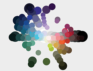
Colours used by the 50 chambers’ websites analysed by Tela
Profile photos provide a great opportunity for differentiation, as well as getting across the brand personality of each chambers and, very importantly, the individual personality of barristers.
We analysed the 50 chambers’ website profile photos for colour, image style, positioning, expression and standardisation.
The majority of chambers’ websites analysed (88%) were found to use full colour profile images; 10% used black and white; and 2% used both colour and black and white. In our view, colour can have a huge effect, adding further impact to the website pages.
On image style, results were very close: 38% used a cut-out, 34% used depth of field and 28% used a backdrop.
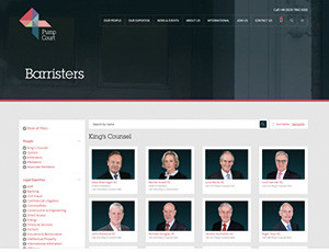
Cut-outs, where the person has been removed from their background and placed on a translucent/colour background, can create a consistent and professional design. It also makes it easy for new members to be added in, to fit with the design of existing images.
A good example of this is 4 Pump Court who have have removed the background of their members’ profile photos completely to create a consistent design:
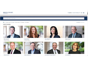
Depth of field is the distance between the closest and furthest objects that are sharp in an image, controlling what appears in focus and what is blurred. This style focuses the eye on the person in the photograph.
Brick Court, for example, uses depth of field in their barrister profile images. Although the backgrounds are slightly different, the design looks harmonious and the focus is on the barristers:
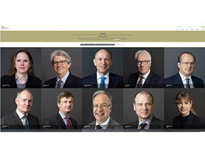
Using a backdrop is another way to have the same/similar backgrounds for each image but without the need to cut the images out.
Atkin Chambers illustrates this style, using grey backdrops:
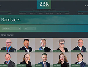
Part of our research studied how individuals were positioned in their photographs. Side-on positioning was most common, with 84% of the websites opting for this throughout their profile images. For example, 2 Bedford Row’s website:
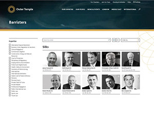
Fewer websites (8%) used images of their members looking away, such as Outer Temple Chambers (below). These images are more natural and candid, which allows the individual personalities to come through. Just 4% opted for face on, and the remaining used a mixture of side and face on.
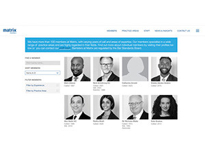
There is a lasting power in first impressions, so the expression adopted in a photo is very important. Barristers who are smiling in their profile images can appear friendly and approachable. We found that 14% of chambers use a mixture of expressions on their websites and 86% opted for happy expressions. Matrix Chambers, for example, uses a mixture of expressions throughout their members’ pages:
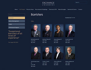
Forty six per cent of the websites used standardised images, i.e. where they follow the same style and design throughout their profile pages which offers consistency. Exchange Chambers’ images have all been taken in front of the same backdrop, at the same height and size and using the same positioning:
Chambers could consider taking photos from the waist up rather than the traditional shoulders up. Currently, most chambers websites use reasonably formal headshots so creating a different or more informal style of photography will add memorability and personality to the profile pages.
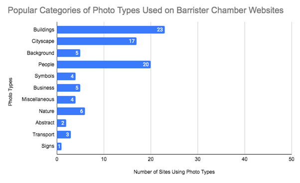
Choice of imagery helps form an immediate impression of a chambers’ brand. Our research found that photos of buildings were the most popular choice on chambers’ websites (see graph).
Some images are of the chambers’ building itself, which gives a personal and brand-specific feel to a website. Many websites opted for images of cityscapes to help indicate the location of chambers and utilise the strong corporate image associated with prestigious city locations.
Forty per cent of chambers’ websites decided to use people as their main focus of imagery. This can help a brand appear more approachable and personal to clients, helping to build trust.
The most popular type of imagery used is photographic (93.5%). Illustrative and typographic images can come across as more impersonal with just 6.5% of the websites using illustrative images such as symbols to help the user navigate through the site. Although this approach can be less personal, if used well and linked to the subject matter, it can be an effective way to differentiate a brand.
Full colour is the most popular choice of colour schemes used by 81.6% of chambers. 14.3% of websites use monochromatic colour schemes based on only one singular hue but varying the tone and tint. Black and white colour schemes are the least popular choice at 4.1%.
Sector-specific images are defined as having a reference to the chambers’ specialism. For example, images of a chambers’ building, team or legal service. The research shows that 40% of sites use sector-specific images.
Stock images are readily available and can be downloaded for little or no cost. They provide a quick and cost-effective alternative to hiring a photographer to create bespoke photos. The downside to stock imagery is that there is no guarantee that it won’t be used by another organisation. Stock imagery can also appear to be non-bespoke or worse, clichéd, cheapening the look and feel of a website and brand.
Sixty per cent of the websites studied used stock images in the main homepage banner.
By conducting this research, we have been able to identify current trends within the areas of colour, profile and general image styles on chambers’ websites. While each chambers’ brand will ultimately need to be presented in a professional manner, the current trends undoubtedly demonstrate opportunities for subtly adapting the visual elements in order to present a more memorable online brand experience.

The legal services sector is packed with organisations offering broadly similar services and claiming to do so at a very high standard. How can chambers can distinguish themselves in this crowded market, establish a clear message and brand, and offer an authentic, credible and engaging experience in order to differentiate them from their competitors?
When it comes to a chambers’ brand’s ‘look and feel’, the decision-making process generally involves a committee. It is not unusual for conflicting and sometimes even emotional views to surface when asking for feedback on something as subjective as a colour or style of imagery. We will never forget the day a senior partner in a large law firm brought in a swatch of fabric from their new curtains. We were told that the firm’s brand colour should change to match what was a very specific shade of green!
To help us structure the creative process and inform our recommendations, we have analysed the websites of the ‘top 50’ chambers for their use of colour, profile photos and imagery: the three key elements when designing a chambers’ website.
Colour is an important way in which to differentiate a brand from others online. We ‘scraped’ the colours from 50 chambers’ websites and found that:
Blue is associated with stability and reliability, purple with luxury and power, and red with power and determination. We can see why these colours are so heavily used but due to the high percentage of chambers using these brand colours, opportunities present for those considering a rebrand to use colour to differentiate themselves in the market.

Colours used by the 50 chambers’ websites analysed by Tela
Profile photos provide a great opportunity for differentiation, as well as getting across the brand personality of each chambers and, very importantly, the individual personality of barristers.
We analysed the 50 chambers’ website profile photos for colour, image style, positioning, expression and standardisation.
The majority of chambers’ websites analysed (88%) were found to use full colour profile images; 10% used black and white; and 2% used both colour and black and white. In our view, colour can have a huge effect, adding further impact to the website pages.
On image style, results were very close: 38% used a cut-out, 34% used depth of field and 28% used a backdrop.
Cut-outs, where the person has been removed from their background and placed on a translucent/colour background, can create a consistent and professional design. It also makes it easy for new members to be added in, to fit with the design of existing images.
A good example of this is 4 Pump Court who have have removed the background of their members’ profile photos completely to create a consistent design:

Depth of field is the distance between the closest and furthest objects that are sharp in an image, controlling what appears in focus and what is blurred. This style focuses the eye on the person in the photograph.
Brick Court, for example, uses depth of field in their barrister profile images. Although the backgrounds are slightly different, the design looks harmonious and the focus is on the barristers:

Using a backdrop is another way to have the same/similar backgrounds for each image but without the need to cut the images out.
Atkin Chambers illustrates this style, using grey backdrops:

Part of our research studied how individuals were positioned in their photographs. Side-on positioning was most common, with 84% of the websites opting for this throughout their profile images. For example, 2 Bedford Row’s website:

Fewer websites (8%) used images of their members looking away, such as Outer Temple Chambers (below). These images are more natural and candid, which allows the individual personalities to come through. Just 4% opted for face on, and the remaining used a mixture of side and face on.

There is a lasting power in first impressions, so the expression adopted in a photo is very important. Barristers who are smiling in their profile images can appear friendly and approachable. We found that 14% of chambers use a mixture of expressions on their websites and 86% opted for happy expressions. Matrix Chambers, for example, uses a mixture of expressions throughout their members’ pages:

Forty six per cent of the websites used standardised images, i.e. where they follow the same style and design throughout their profile pages which offers consistency. Exchange Chambers’ images have all been taken in front of the same backdrop, at the same height and size and using the same positioning:

Chambers could consider taking photos from the waist up rather than the traditional shoulders up. Currently, most chambers websites use reasonably formal headshots so creating a different or more informal style of photography will add memorability and personality to the profile pages.
Choice of imagery helps form an immediate impression of a chambers’ brand. Our research found that photos of buildings were the most popular choice on chambers’ websites (see graph).
Some images are of the chambers’ building itself, which gives a personal and brand-specific feel to a website. Many websites opted for images of cityscapes to help indicate the location of chambers and utilise the strong corporate image associated with prestigious city locations.
Forty per cent of chambers’ websites decided to use people as their main focus of imagery. This can help a brand appear more approachable and personal to clients, helping to build trust.
The most popular type of imagery used is photographic (93.5%). Illustrative and typographic images can come across as more impersonal with just 6.5% of the websites using illustrative images such as symbols to help the user navigate through the site. Although this approach can be less personal, if used well and linked to the subject matter, it can be an effective way to differentiate a brand.
Full colour is the most popular choice of colour schemes used by 81.6% of chambers. 14.3% of websites use monochromatic colour schemes based on only one singular hue but varying the tone and tint. Black and white colour schemes are the least popular choice at 4.1%.
Sector-specific images are defined as having a reference to the chambers’ specialism. For example, images of a chambers’ building, team or legal service. The research shows that 40% of sites use sector-specific images.
Stock images are readily available and can be downloaded for little or no cost. They provide a quick and cost-effective alternative to hiring a photographer to create bespoke photos. The downside to stock imagery is that there is no guarantee that it won’t be used by another organisation. Stock imagery can also appear to be non-bespoke or worse, clichéd, cheapening the look and feel of a website and brand.
Sixty per cent of the websites studied used stock images in the main homepage banner.
By conducting this research, we have been able to identify current trends within the areas of colour, profile and general image styles on chambers’ websites. While each chambers’ brand will ultimately need to be presented in a professional manner, the current trends undoubtedly demonstrate opportunities for subtly adapting the visual elements in order to present a more memorable online brand experience.

Fifty chambers’ websites have been analysed and the results are in… Tim Sheed reveals design trends and opportunities to differenitiate

Chair of the Bar finds common ground on legal services between our two jurisdictions, plus an update on jury trials
A £500 donation from AlphaBiolabs has been made to the leading UK charity tackling international parental child abduction and the movement of children across international borders
Marie Law, Director of Toxicology at AlphaBiolabs, outlines the drug and alcohol testing options available for family law professionals, and how a new, free guide can help identify the most appropriate testing method for each specific case
By Louise Crush of Westgate Wealth Management
Marie Law, Director of Toxicology at AlphaBiolabs, examines the latest ONS data on drug misuse and its implications for toxicology testing in family law cases
An interview with Rob Wagg, CEO of New Park Court Chambers
With at least 31 reports of AI hallucinations in UK legal cases – over 800 worldwide – and judges using AI to assist in judicial decision-making, the risks and benefits are impossible to ignore. Matthew Lee examines how different jurisdictions are responding
What has changed, and why? Paul Secher unpacks the new standards aligning the recruiting, training and appraising of judges – the first major change to the system for ten years
The deprivation of liberty is the most significant power the state can exercise. Drawing on frontline experience, Chris Henley KC explains why replacing trial by jury with judge-only trials risks undermining justice
Ever wondered what a pupillage is like at the CPS? This Q and A provides an insight into the training, experience and next steps
The appointments of 96 new King’s Counsel (also known as silk) are announced today